


Mobile usage is growing, meaning responsive email design is more important than ever.
Image courtesy of Pexels.

Think back to a time when you opened an email on your smartphone, tablet, or even desktop and it didn’t just didn’t look right. Maybe the images were too wide for your smartphone or everything seemed too small on a desktop.
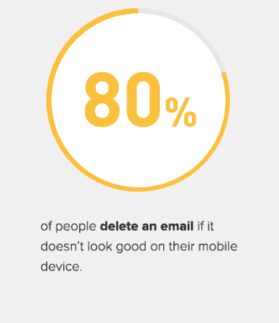
If this has happened to you anytime recently, more likely than not you just deleted the email and moved on with your life — and you’re not alone. In fact, 80% of people will delete an email that doesn’t look right on their device.
By not using responsive email design there’s a good chance you’re losing a large number of leads. If anywhere near 80% of your subscribers are deleting emails due to poor design, you have nothing to lose and will see huge improvements in your metrics with responsive design. Image courtesy of Smart Insights.
That’s the power of responsive design. Doing it wrong will surely lose customer interest, but doing it right will provide a better user experience and boost your metrics.
As mobile adoption grows people expect that emails and websites will work seamlessly, no matter what device they are on. When things don’t meet their standards on mobile, people will simply choose to ignore it rather than pulling it up on a desktop once they’re at home.
That’s why you need to be considering how emails will render on all devices and using responsive design for all the different communication you send to your subscribers.
In this article, we’ll dive into the responsive email design by covering topics like:
- What responsive email design is and why it’s important
- How responsive design tools can help improve your email marketing strategy
- Four best practices to creating responsive emails
Responsive Email Design 101
Before jumping too far down the responsive email design cycle, let’s take a quick step back and talk about what responsive design is and why it’s so important for your email marketing.
Simply put, responsive email design allows the content to adapt to the device it is being viewed on. This means that it will automatically identify if someone is viewing the content on a smartphone or a desktop and show the content in the correct format.
When creating emails, it’s important to consider responsive design in a variety of different ways. The most obvious is the size of the screen, but you’ll also want to consider such as, image sizes, how the text will appear, and if things will stack, hide, or change based on the device it’s viewed on.
Why is responsive email design so important?
Over 65% of emails are opened on mobile devices. That means a large number of your customers are opening emails on their mobile devices over a desktop. If you’re still designing emails assuming most of your customers are using desktops, it’s time to take another look at the statistics.
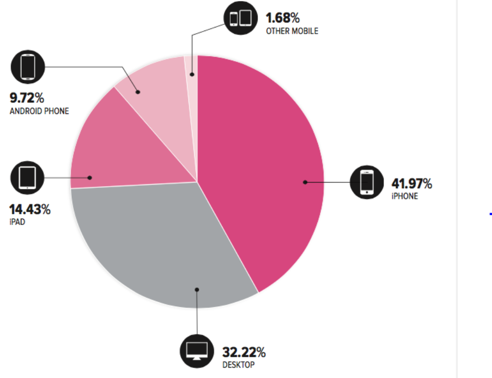
The usage of mobile devices blows desktop usage out of the water. People are no longer constrained to checking their emails when they’re plugged in — and these numbers tell us that they prefer the mobile option. Image courtesy of Marketing Land.
If you don’t take the time to consider responsive email design, you’re only hurting yourself. As we mentioned above, if an email doesn’t render correctly on a device, they’re much more likely to delete it and move on than come back and check it later. Poorly designed emails will encourage users to choose this option.
On the other hand, if responsive design is part of your email marketing strategy you will see the opposite effect. When done right, responsive email design will increase click-through rates.
Sending responsive emails will make it easier for customers to take the action you want them to do. If the email doesn’t open properly, they may not see the call to action or might miss some of the important copy and imagery you are sharing with them. When important information is easy to find and right in front of them, it’s much easier for them to get from point A to point B.
At this point, you might be thinking “this sounds like more work for my already busy team.” But the good news is that with the right tools — it should make it even easier.
Responsive Email Design Tools
Knowing that we all already have more on our plates than we can handle, thinking about changing your email marketing process might sound intimidating. The good news is that there are responsive email design tools out there to help simplify the process.
With programs that utilize predetermined templates, you can simply drag-and-drop your content onto a template that is already designed and coded to be responsive. This means that there is no guesswork if you don’t have the recourses to product responsive design in-house and your email marketing will always appear consistent.
Anytime you are contacting your customers, you should be thinking about mobile-first, but for many marketing teams just don’t have the resources. That’s why taking advantage of these types of tools can improve your process beyond just coding and design.
Responsive Email Design Best Practices
While using tools to help create your response email design, having a basic understanding of how the design works will be beneficial to anyone working on these types of emails. From the copywriter to the designer, there are a few responsive design best practices to keep in mind.
Here are a few things to consider as you create your responsive emails.
Sizing is Always Important
You’ll want to consider the size of multiple different components throughout your email. To make sure your customers have the best customer experience, you’ll want to keep certain elements to a standard size.
- The subject line and preheaders. Although this is not specific to the design creation, it’s still a very important thing to remember. When writing your subject line and preheader text, you’ll want to think about the character limit of mobile. The best practice is to keep these two copy points under 65 characters. This will ensure they fit on all browsers, email clients, and devices.
- Idea email width: You don’t want to make the width of an email too large, forcing someone to scroll to see the entire message — but you also don’t want the opposite to happen. Designing email at a width of 600px will ensure your email renders properly on all devices and browsers.
- Image sizes. If images are not sized properly, they can easily get distorted and show up blurry. For best results, images should be 72 dpi to display crisply and have an optimized load time.
Keep Important Details Above-the-Scroll
Have you ever opened an email on your phone and felt like you scrolled and scrolled but it just never ended? When you start to stack the content of an email, it can happen quicker than you realize.
That’s why it’s important to put the most important information at the top of the email — before the user even has to start scrolling. One tip to help achieve this is to hide the preheader area. This will eliminate 90 characters and leave more space for the meat of your content.
While this was a long email on a smartphone, it gets to the point right away so a user knows what the main point is — the after Christmas sale and discounts. This information is much more likely to keep someone scrolling than a generic opening and image. Image courtesy of Macy’s Marketing.

Optimize Text
Typography is one of the most important elements in your email design. When you consider that more than half of emails are opened with images turned off, you need to make sure the content is there to tell the story.
For the best results using HTML text in your email is a good practice. It’s a great option when it comes to copy-heavy areas, but also helps create crisp and legible text in all scenarios. HTML text will automatically scale up and down depending on the device it is shown on. So no need to worry who sees it on mobile versus desktop.
Here are a few things to consider about optimizing the email text:
- Text sizing. If the text is too small, a user will have to zoom in to read it. In most cases, someone will delete it before they take the time to zoom in. A good rule of thumb for text size is 13px is the minimum legible font size for most mobile inboxes.
- Coupon code text. The point of a coupon code is for someone to use it — right? Make it easier for them by typing the coupon out in HTML text. This will allow people to easily copy and paste the code when they are making a purchase. The easier it is, the more likely someone is to complete a purchase.
Improve Your Call to Action
Having a good call to action (CTA) in your email will help lead a customer down the path to purchasing. If your CTA gets lost due to formatting on a mobile device, the user now has no idea where they should be going to learn more or make a purchase. This could be the reason you’re seeing less than ideal results from your emails.
Luckily, responsive email design will always consider the sizing and adjust so that the CTA is visible on the page. But you can take it a step further to improve your CTA even more with these best practices.
- Use a high-contrast CTA button. Make sure your customers see the CTA by using contrast to call it out. Don’t let it blend in with the rest of the content in the email, it should stand out and let people know to “click here.”
- Increase buttons size. Remember that mobile users are not using a mouse to navigate through their screens. Your button sizes need to accommodate this. To do that, make mobile buttons a little bigger so it is easier to quickly tap.
- A/B test for best results. A/B testing is always in your best interest when working to understand what works best for your customers. CTAs are a great component to test and you’ll see the results directly to your bottom line.
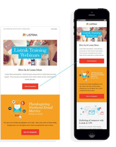
Make sure your CTA stands out from the rest of the email. Use bold colors that contrast with the imagery around it to ensure customers know exactly what the next step is and where to click. Image courtesy of Listrak.
Responsive Email Design is Here to Stay
If you’re not already on board with responsive email design, you should really consider making the switch. Mobile usage will only continue to increase and so will the expectations of your customers for mobile-friendly emails.
For those already using responsive design, it’s important to stay on top of the trends as technology changes. With the help of all the available tools, you can master the world of responsive design, stay up-to-date, and improve your email marketing strategy in a number of ways.
Now that you know what to consider and how responsive email design improves the customer experience, you have everything you need to get started.